In 2022, Neon set out to reposition its brand, proving it could offer much more than a typical bank.
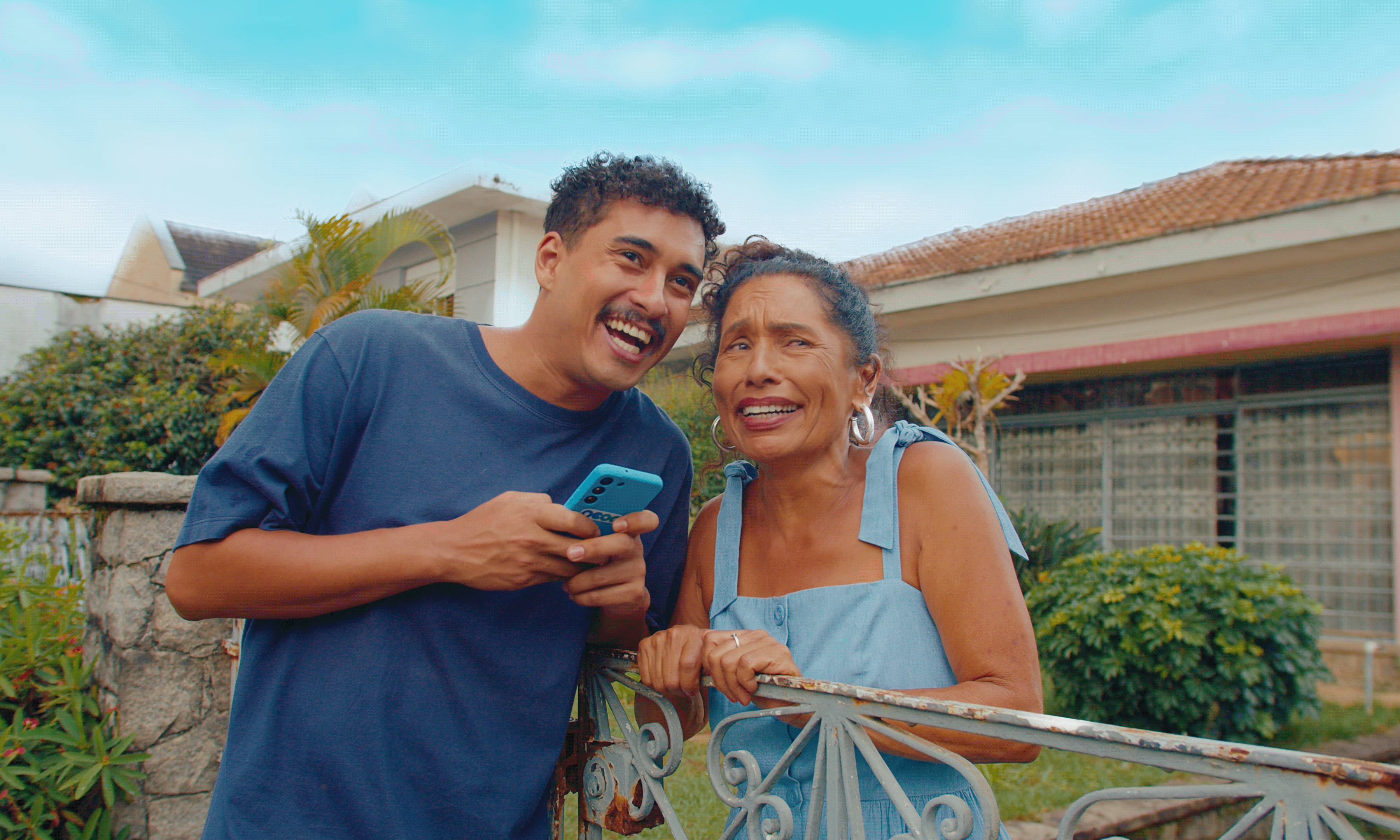
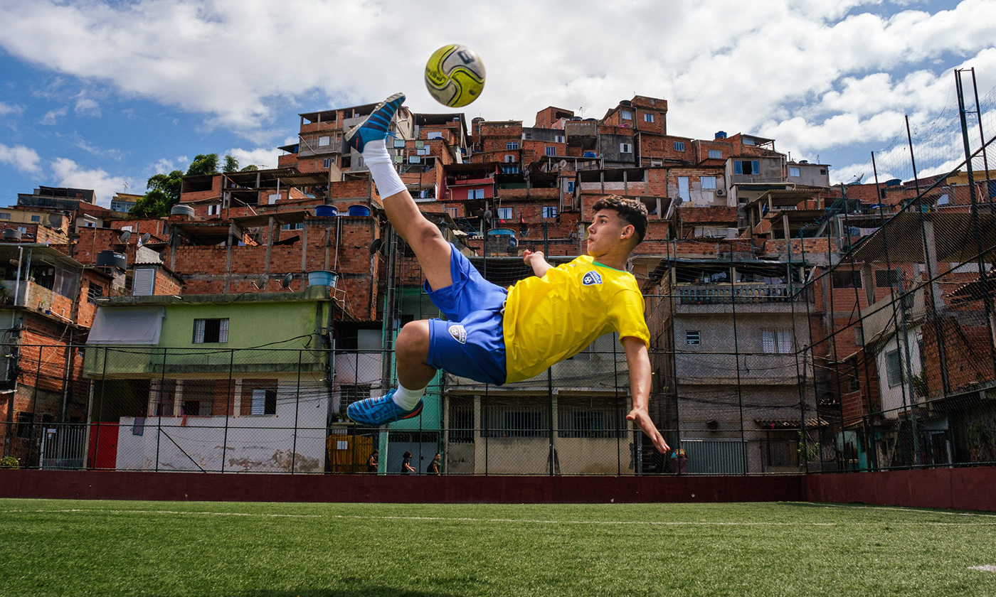
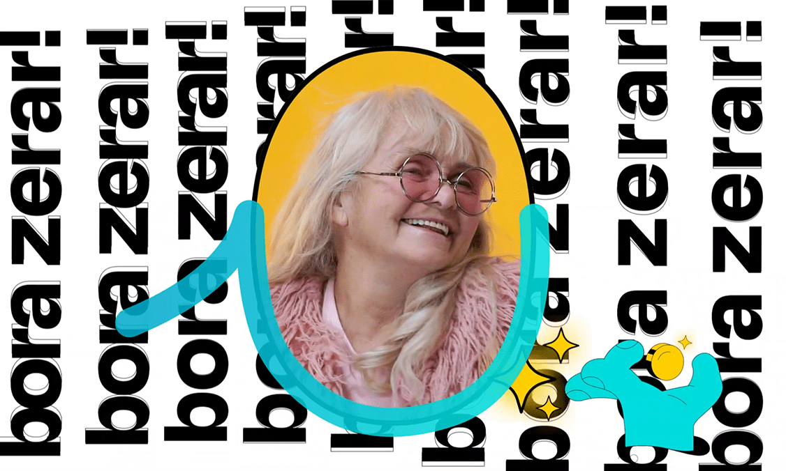
As part of Neon’s brand evolution, we created a playful, culturally resonant activation to introduce the new visual identity to the public.
The idea was rooted in a pun that only works in Portuguese: the word "banco" means both "bank" (financial institution) and "bench" (a seat in a public square).
So, we announced the opening of Neon’s "first bank" — but not a traditional bank branch. Instead, it was a literal bench in the main square of Pracinha (that means little square in Portuguese), a small town in the interior of São Paulo, which, in reality, had no banking services at all.
The activation turned a literal absence (no bank branches) into a symbolic presence (a community gathering spot offering access and connection). We built a lounge in the town square, equipped with free Wi-Fi and branded installations, creating a vibrant, welcoming space.
A short film — styled as a humorous mockumentary — captured the entire story, blending documentary realism with Brazilian internet meme culture. The project reinforced Neon’s mission: bringing financial solutions closer to people, wherever they are.
Creative solutions and deliverables
• Creation of a branded lounge in Pracinha’s town square, with Wi-Fi, benches, and colorful experiences
• Short film for Instagram and TikTok mixing humor and local storytelling
• Press kits for influencers and media featuring the tagline "More than a bank, Neon"
• Two-phase PR strategy (exclusive reveal + wide distribution)
• Meme-inspired social content to boost organic engagement
Highlight
This activation cleverly transformed a brand refresh into a real emotional connection with the audience — showing that banking with Neon isn’t about big buildings, but about being accessible, present, and human at every level.
